For Travelers, We Empowered Them To Create And Customize Their Own Safe Travel Plans.
Triplan provides an easy and reliable travel experience through using accurate data and information to help travelers confidently plan their trips so they don’t have to worry about safety. At the same time, they can relax and enjoy their own travels through various things to do for fun.
Duration
Screen Resolution
9 days
360 x 740
Project type
Tools
Team (3 members)
Figma, Miro, framer, pencil, paper
My main role
User Research, survey, wireframe, prototype, usability testing
Problem & Opportunity
Travelers have difficulty choosing and planning the right places to visit in a given amount of time and need reliable information to ensure their safety.
Solution
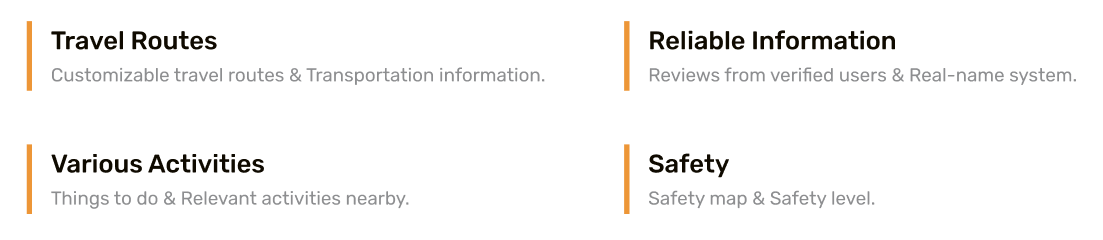
Triplan provides travelers optimized travel routes based on their current location so they can quickly and conveniently create their travel plans with the accurate data.
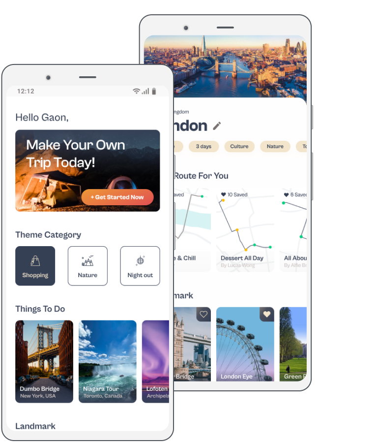
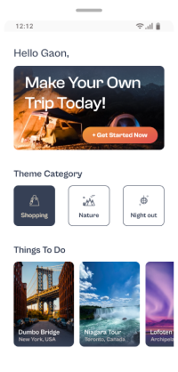
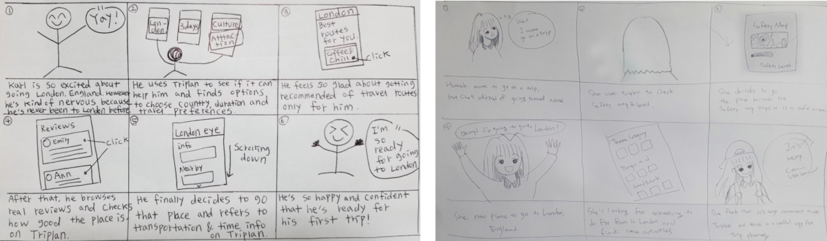
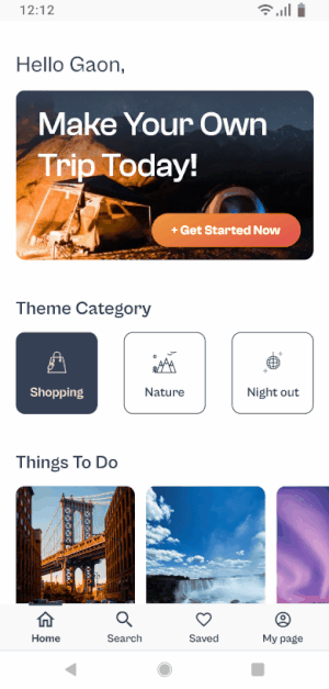
Onboarding
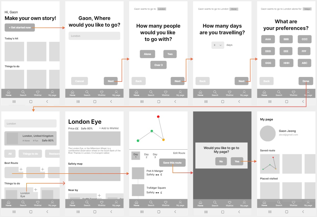
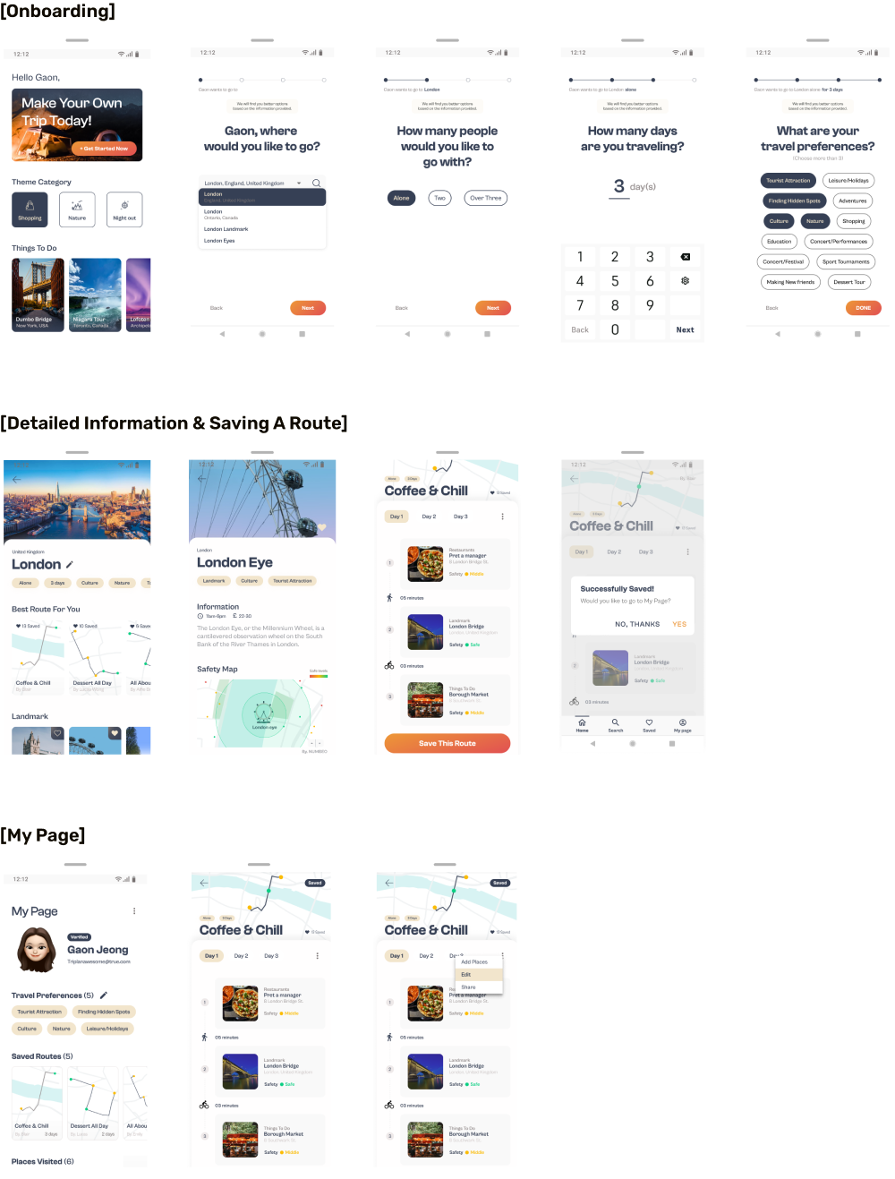
When users tap the Get Started Now button, they can fill out a 4 step process which allows them to have accesses to customized information and options.
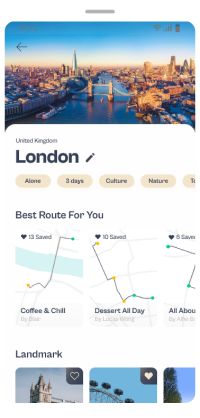
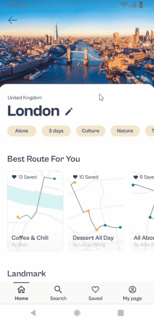
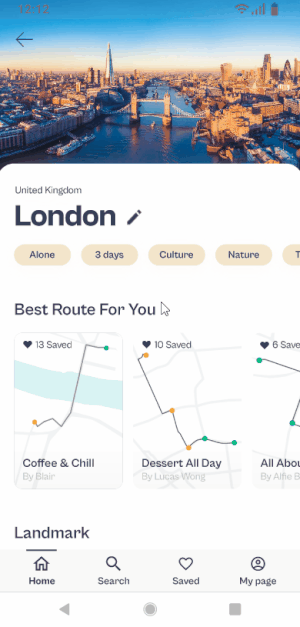
Best Routes
Once completed the previous steps, users can see the best routes based on information they typed, and can add or change places as they desire.
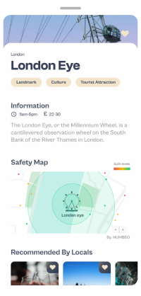
Safety & Detailed Info
Users can see Safety Map, Verified Reviews and Near By information which can help users plan safe trip and have more reliable and accurate data.
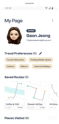
My Page
On My Page, users can change some options. They can set travel preferences and see saved routes. In addition, they can edit places visited and reviews.
On day 1 to 2, my team and I focused on creating ideas and synthesizing information from the various perspectives. After combining and prioritizing the problems and ideas through affinity mapping, we concluded the goal for this project.
Objective
To have a common understanding of multiple perspectives including the market, the users, and others to generate ideas and options as many as possible to decide a goal to focus on for the project.
What we need to consider is…
Market
Competitive Analysis
What are the trends and travel industry standards now?
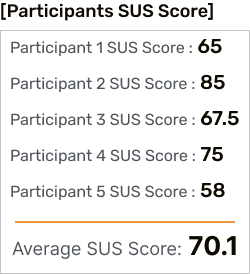
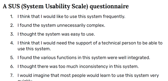
It was proven that it’s good to use, which is above the average of 68 SUS score and is a validated & acceptable concept.
Deliverables
Onboarding
When users tap the Get Started Now button, they can fill out a 4 step process which then allows them to have accesses to customized information and options.
Best Routes & My Page
Once users complete the four step onboarding process, Triplan recommends the best routes to them and the users can see the saved routes on My Page. It facilitates users to add and change places as they desire.
Safety & Detailed Info
Users can see Safety Map, Verified Reviews and Near By information which can help users plan safe trip and have more reliable and accurate data.
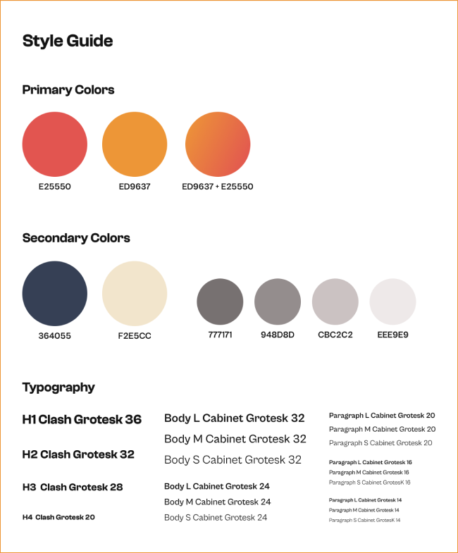
style guide
We chose exciting fonts and colors to provide bright and more vibrant image of the app.
What I learned
Time management
Time was very limited while working on this project. However, I would assume that chances are high that this does happen regularly in the field. Through this project, I learned how to effectively manage and spend my time.
Prioritization
To finish the work on time, we had to prioritize problems and focus on solutions. Instead of making pixel-perfect design, it was helpful to create the screens that we really have to concentrate and test if it is acceptable to use.
Next steps
Iterations
The next step is to continue making iterations to the screen layout and features so we can provide the best user experience.
More features
Next time, I want to add some of features including Community, Messaging, and Best Cost-Effective Plans to help travelers find the best tips and advice for their travels.