For Spotify Users, We Created A “Social” Function To Provide An Enjoyable And Interactive Experience.
Due to COVID-19 the music industry has evolved to become more streaming-oriented, and more people have turned to music to relieve their stress. Under these new circumstances, we found a space to give people an exciting and fun opportunity to experience Spotify on a more interactive level with its large platform of users. As a result, we developed a new feature called “Social”, which allows users to easily interact with loved ones while discovering more music based on their preferences.
Duration
Screen Resolution
10 Weeks
375 x 812
Project type
Tools
Team (4 members)
Figma, Miro, paper, pencil
My main role
Research, User Interview, A/B testing, usability testing, prototype
Problem & Opportunity
We identified that Spotify was not maximizing on the opportunity to connect the wide community of streamers, and the isolating nature of the pandemic provided even greater needs of social interactions with one another.
Solution
We suggest “Social” function that helps people interact with others and find more music based on personal preferences.
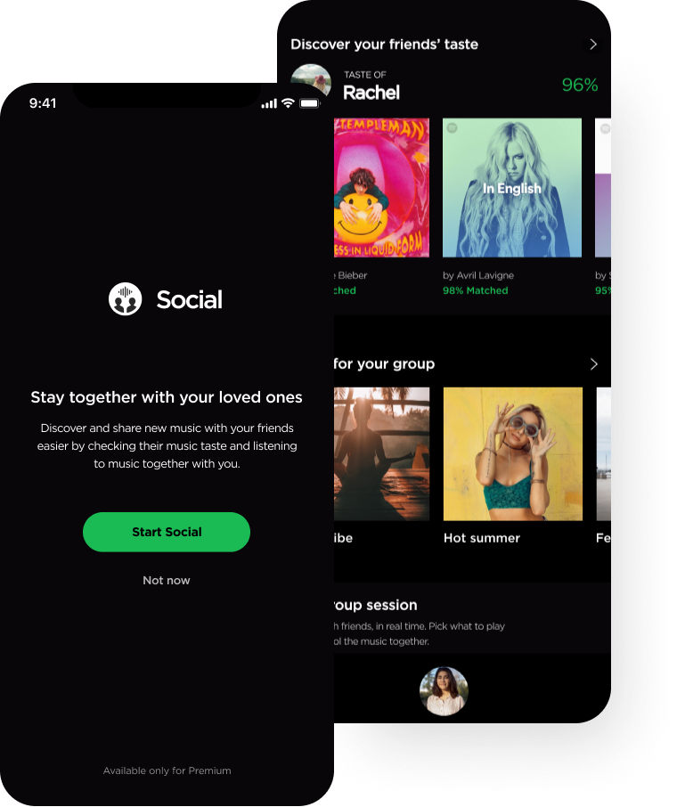
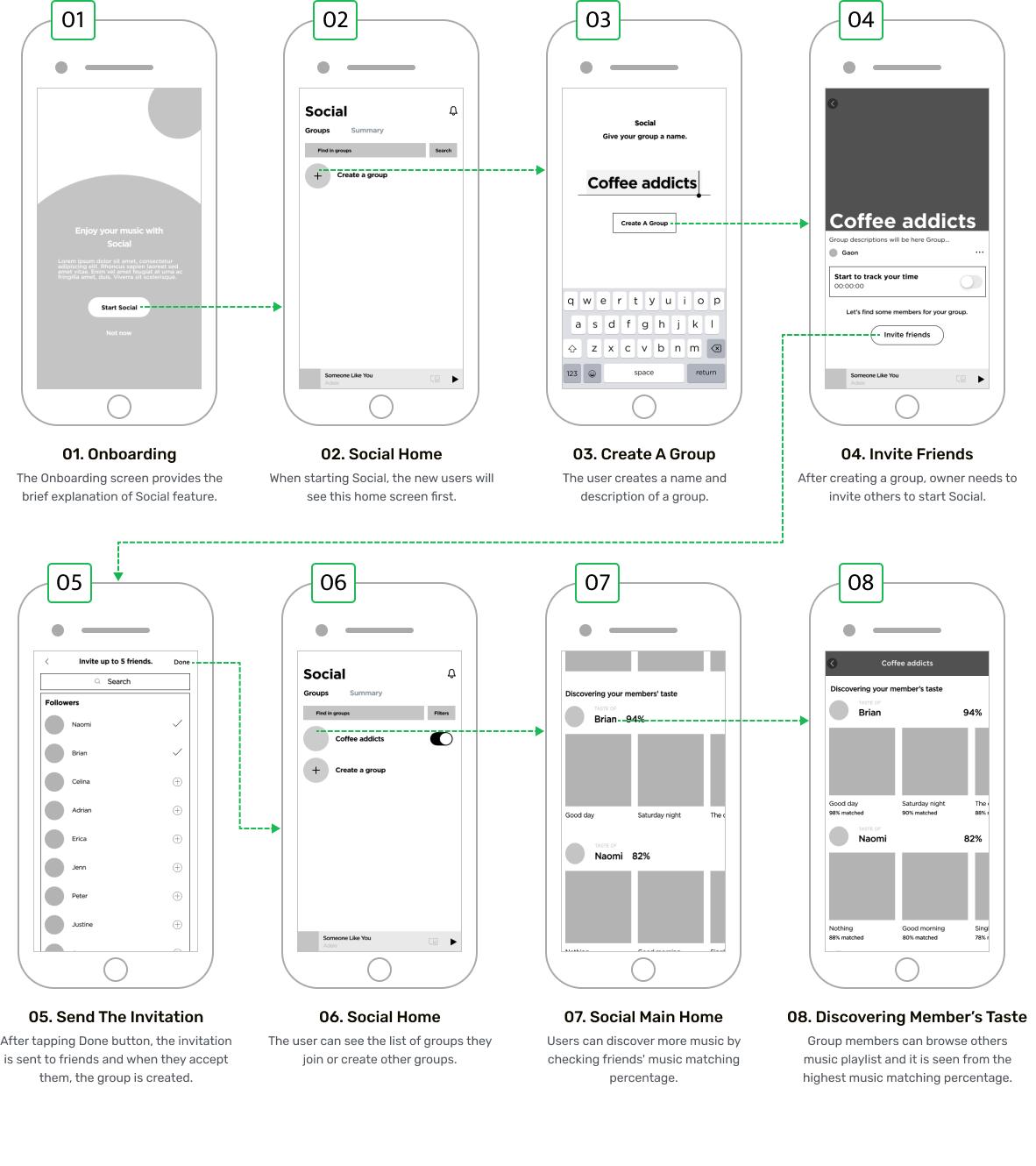
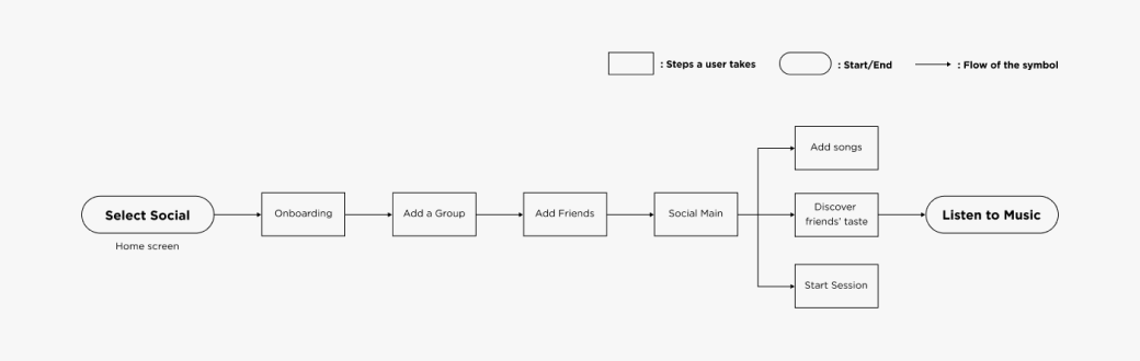
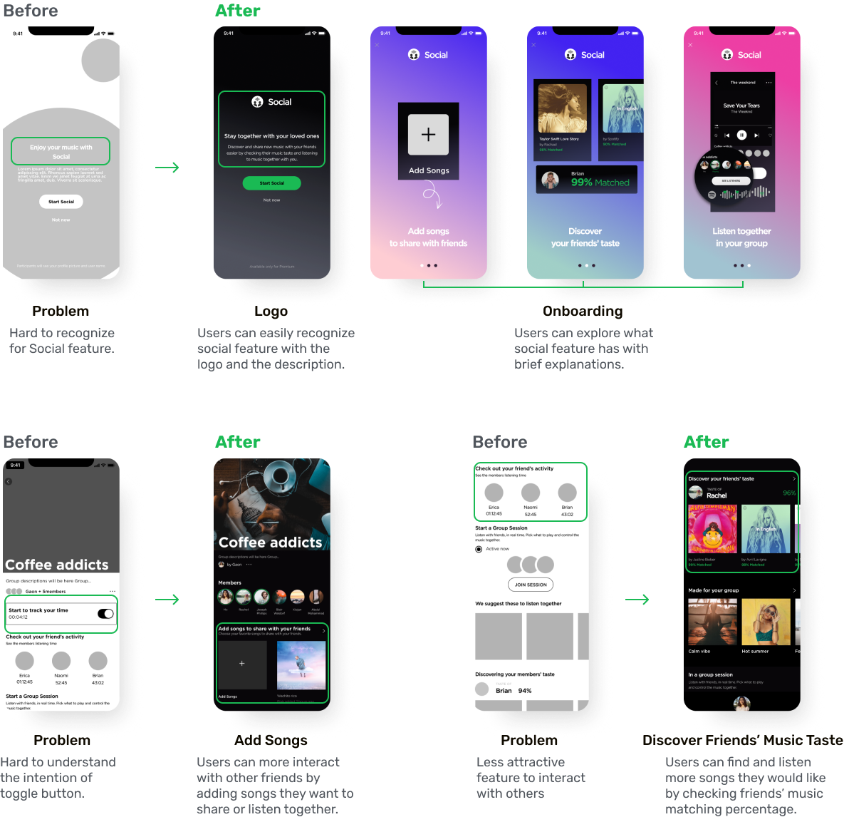
Onboarding
Social Onboarding introduces and guides users to understand and discover the interesting features that Social has to offer.
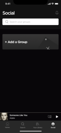
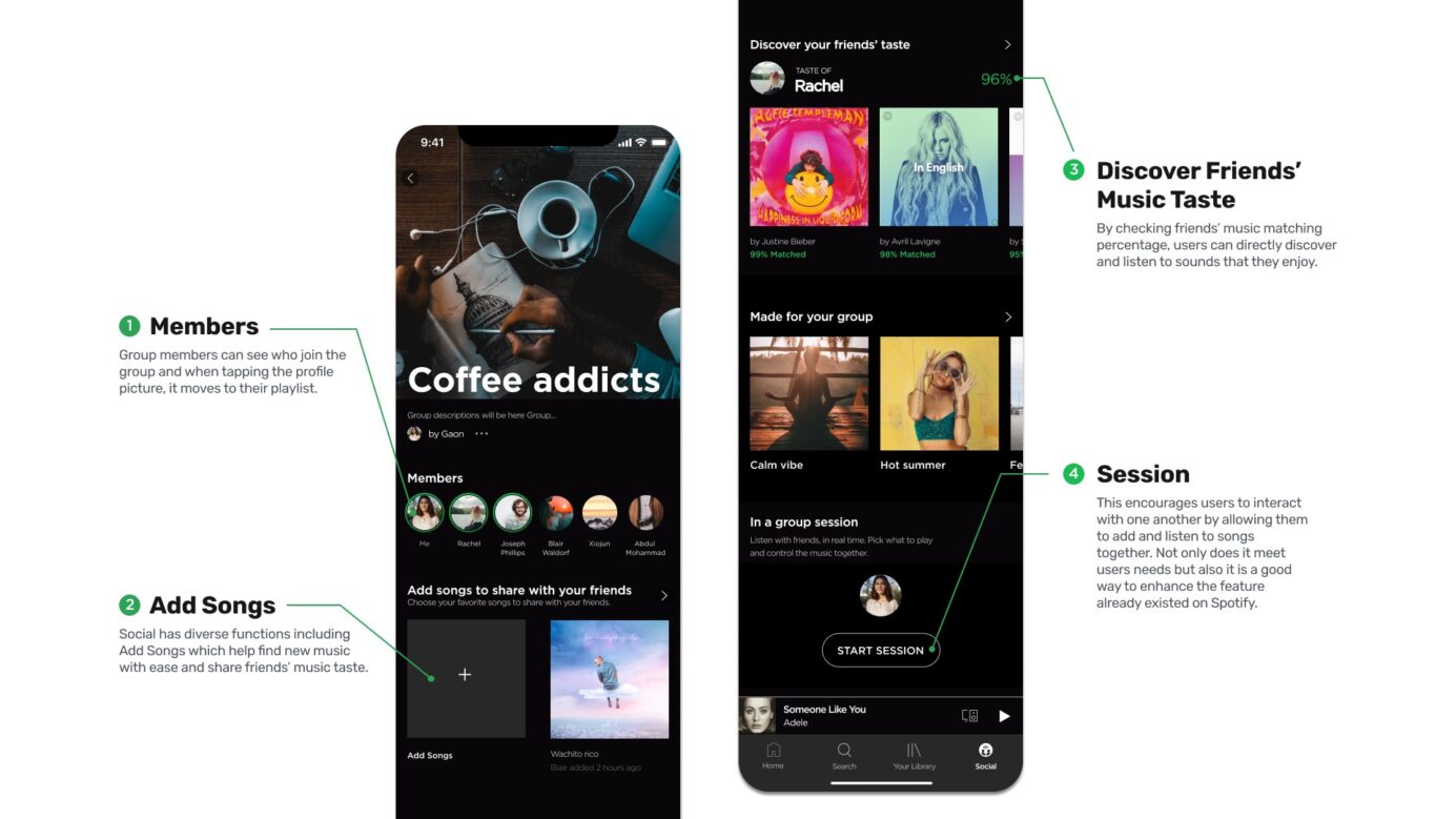
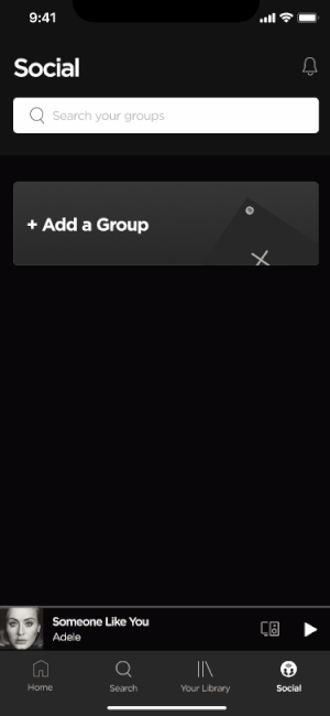
Add a group
To join Social, users need to make a group and add friends either through inviting followers or using an invitation link.
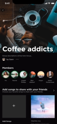
Add songs
Social has diverse functions including Add Songs which help users to find new music with ease and discover their friends’ music tastes too.
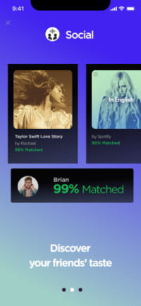
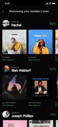
Discover friends’ tastes
By checking friends’ music matching percentage, users can directly discover and listen to sounds that they enjoy.
I researched various information to understand the broad music industry as well as the key players who can suggest solutions for the industry’s challenges.
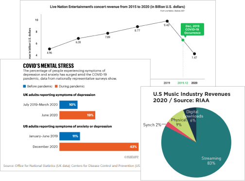
Understanding the Music Industry
While live music concerts and festivals have been put on hold due to the pandemic, music streaming platforms such as Spotify and Apple Music are leading the music industry and increasing their profits.
Opportunity: I wonder if it would be possible to revitalize the music industry by capitalizing on Spotify, a leader in the music streaming market, during Covid-19.
Understanding People
Most people suffered from mental health issues during the pandemic. To relieve their stress, they spend a great deal of time listening to music and engaging with their favorite artists through participating in online live streaming concerts to support their favorite musicians.
Opportunity: Since people still crave human connection during the pandemic, wouldn’t it be great to provide such an experience for them?
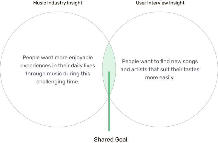
People want more enjoyable experiences in their daily lives through music during this challenging time.
Lift up
the mood
People need their happiness and relief.
Communicate
with loved ones
People need more interaction with those who truly care.
Engage
with activities
People need more fun things to do.
user interview
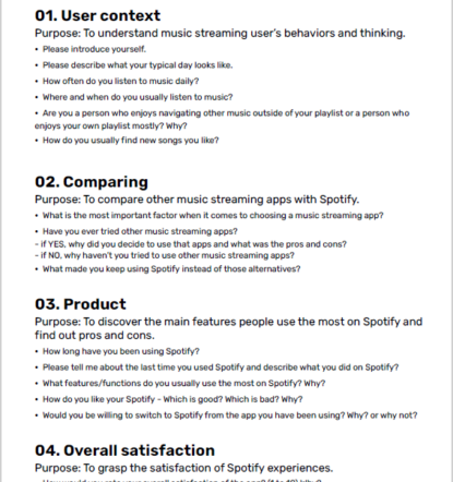
We conducted user interviews to focus on key pain points for users of both Spotify and other music streaming apps, to identify where we could create better streaming experiences for them. The interview was divided into 4 parts: User context, Comparing, Product, and Overall satisfaction.
Participants
11
Music streaming app users
6
Early 20’s to mid 30’s females
5
Early 20’s to mid 30’s males
Some questions we asked during the interview were:
When do you first use the music app on a typical day?
What is the most important factor when it comes to choosing music streaming apps and why?
When you navigate new songs you like, how do you usually find them?
While using Spotify, which part/feature do you usually use the most and why?
How would you rate your overall satisfaction of other music streaming apps and Spotify and why?
Based on the user interviews, the key insight was:
People want to find new songs and artists that suit their tastes more easily.
“I like to browse my friends’ playlists but quite often, it doesn’t fit my taste. ”
-Pia / 22 / Student
Strengthen existing personalization features
“It is difficult to navigate different menus and I have to find the hidden options.”
-Kale / 32 / Fraud Analyst
provide
intuitive information
“Spotify sometimes recommends the same songs to me, and this makes me feel bored.”
-Sasha / 26 / Counselor
Enable users to discover more engaging music
All things considered, this was what we had to move forward:
We need to provide fun experiences to users that help them interact with others and find more music based on their individual preferences.
How might we ensure that users can have meaningful, fun connections with their friends while discovering new music online?
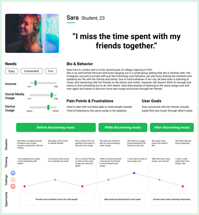
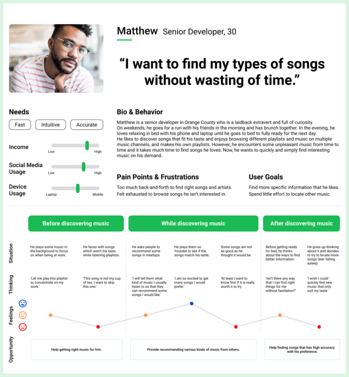
personas & user journey maps
We created 2 main personas and journey maps, which are based on the result of the research to effectively grasp users’ perspectives, pain points and needs on Spotify.re
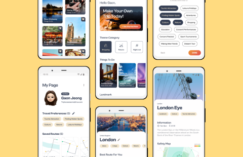
initial sketches & Mid-fi wireframe
We brainstormed ideas and sketched out some functions to focus on and named the feature “Social” to give a more exciting impression. After that, we created Mid-fi wireframe and prepared for some testing.
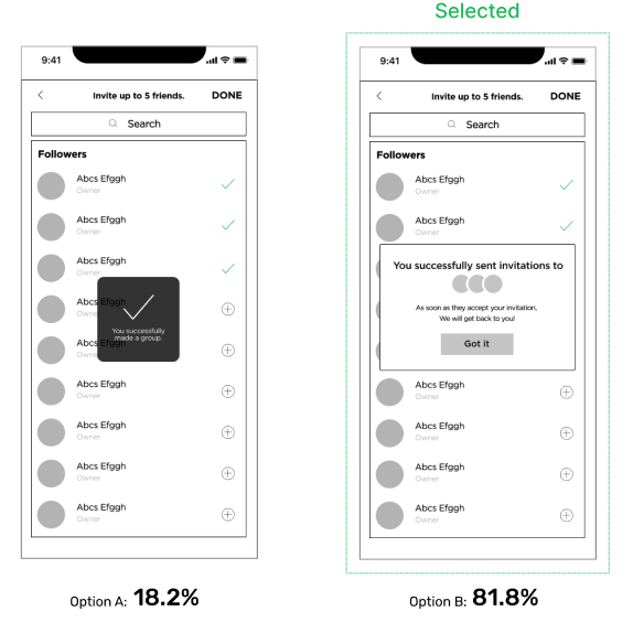
I conducted A/B testing with to see which one performed better and thus choose the right option for the users.
Participants
11
Music streaming app users
6
Early 20’s to mid 30’s females
5
Early 20’s to mid 30’s males
Objective
Which one runs more smoothly when inviting friends to make a group?
Result
According to the A/B testing, option B was selected by the majority of people: 81.8% of people selected option B, while only 18.2% selected option A. Many people wanted to know that how many friends they had invited, as well as the next steps and progress after they sent the invitations.
Testing
I showed the two options below to the users and asked them which one felt more comfortable to use.
Usability Testing
My team conducted usability testing with 8 participants and a wireframe to find out if people were able to complete the given tasks without any issues and find out where there was room for improvement.
Objective & Result
63%
Success rate (5/8)
[Social function & Icon]
People fairly understood the Social function and icon.
13%
Success rate (1/8)
[Toggle button & Ranking]
People rarely understood the usage of Toggle button and Ranking and were not interested in the both functions.
88%
Success rate (7/8)
[Music matching percentage]
People understood Music matching percentage well.
88%
Success rate (7/8)
[Session]
People understood Session well and were able to recognize this feature which is already existed on Spotify.
Task flow
We finalized the task flow after testing. It was a start to finish flow of the Social feature from the perspective of a new user.
updated design
We created the updated design, which was adapted according to the result of the testing above.
Final User interface
Onboarding
Social Onboarding introduces and leads users to understand and find more interesting features that Social has to offer.
Add a group
To join Social, users need to make a group and add friends through either followers or an invitation link.
style guide
The style guide below shows typography, colors, logos, buttons and icons used for providing more Spotify-like-look.
What I learned
Test often and early
Conducting usability testing earlier in the process would have helped me to create better designs and features more. As a result of the testing, I could understand users’ thoughts and perspectives that I wouldn’t have known if I didn’t carry this out.
Collaboration
I was able to learn how to be open-minded when communicating with others, so I could understand their perspectives and choose better options and designs.
Next steps
Observation
Due to social distancing, I was limited to how many people I could interview and meet in person. Next time, I will find more effective methods to observe and understand the users’ behaviors and thought process.
Website version
The next steps would be to build a desktop version for the Social feature where I can add more features on the layout in which I can’t add on the mobile version.